With the U.S. presidential election in full swing, a crucial question arises: Can everyone easily and comfortably participate in the democratic process? While more and more state election sites offer the convenience of online voter registration, accessibility often seems to be an afterthought.
Ten years have passed since the last comprehensive accessibility evaluation of state election sites. Technology has advanced rapidly during this time, and so have the expectations for inclusive digital experiences. Yet, our findings reveal that many of the same accessibility barriers persist. For example, a staggering 77% of online voter registration sites don’t clearly label the different fields on the registration form, making it hard for people who use screen readers to understand what information is needed.
Read our report to learn more about the current state of web accessibility in online voter registration sites across the United States.
Executive Summary
Online voter registration in the United States has seen a steady adoption over the years. Pioneered by the state of Arizona in 2002, it was introduced to 19 more states by November 2014.
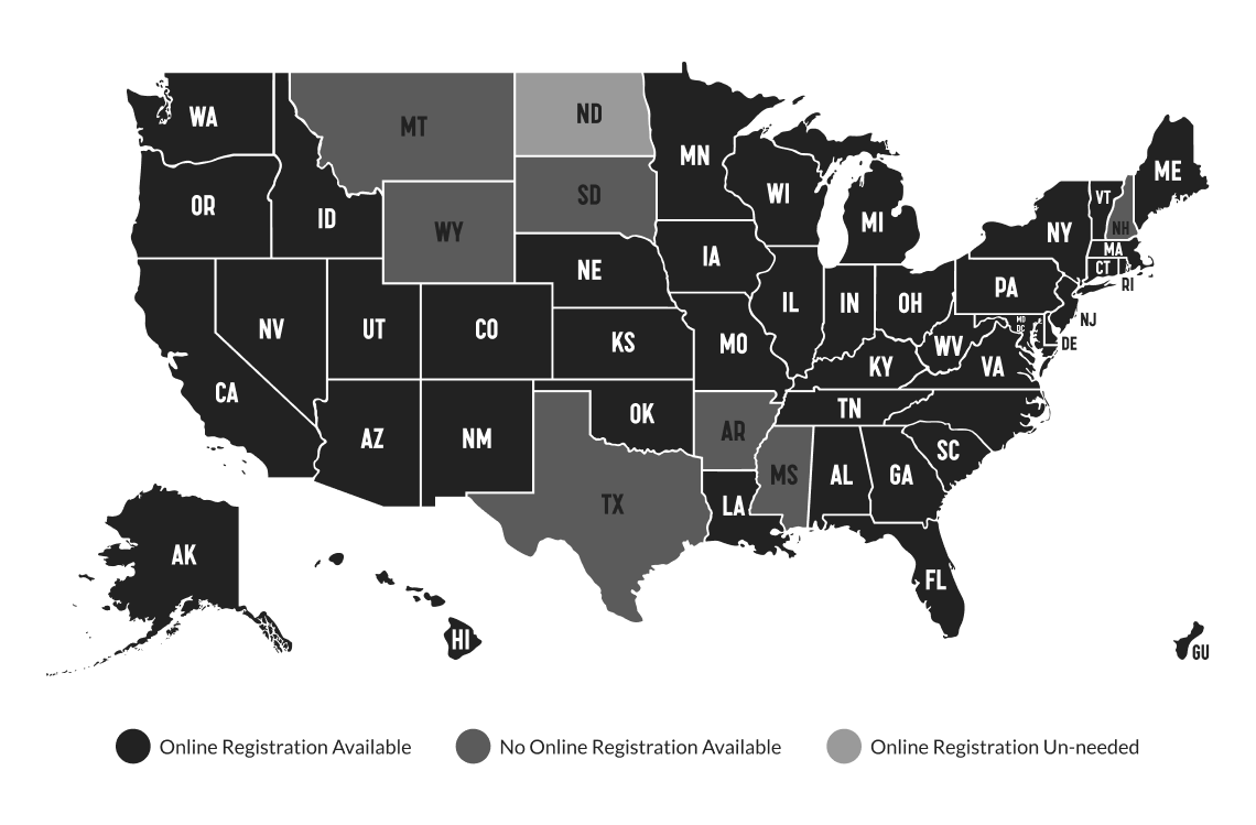
Fast forward to 2024, online voter registration is present in 42 U.S. states, Washington D.C., and Guam.
Technological advancements and the popularity of various digital platforms force state governments to respond to those changes and shift political engagement online. At the same time, providing online voter registration is not a mere reaction to the world dynamically changing. If implemented with accessibility in mind, online voter registration offers several benefits:
- Inclusivity and Equal Access: Accessibility ensures that all eligible voters, including those with disabilities, can register to vote independently and with dignity. This supports the principle of equal access to democratic participation. In 2020, an estimated 38.2 million people with disabilities were eligible to vote. In 2024, this is expected to rise to above 40.2 million.
- Enhancing Voter Turnout: By making the registration process easier and more accessible, more people, including those with disabilities, will likely register and vote. This can lead to higher voter turnout and a more representative democracy. In 2020, about 67% of eligible voters cast ballots, which means a third did not. That amounts to about 80 million people who stayed home, with 29% of them not participating because they were not registered.
- Increased Accuracy & Administrative Efficiency: Registration forms filled out by hand are sometimes hard to decipher, which leads to mistakes and delays caused by the need to verify that information. Online voter registration solves this problem because everything is in a typed format. Also, the electronic form can pinpoint incorrect input in real time, contributing to greater accuracy.
- Legal Compliance: Laws like Title II of the Americans with Disabilities Act (ADA) and Section 508 of the Rehabilitation Act mandate that government services, including voter registration, be accessible to people with disabilities. Non-compliance can lead to legal challenges and the disenfranchisement of voters.
While the benefits of online voter registration are crystal clear, the quality of its implementation hasn’t been studied enough. This quality issue is specifically tied to concerns with providing comprehensive web accessibility.
In 2014, the American Civil Liberties Union (ACLU) in partnership with the Center for Accessible Technology (C4AT) conducted an accessibility evaluation of 20 state websites with online voter registration. They found that only California’s website was fully accessible for people with disabilities, whereas the rest of the sites didn’t even meet basic accessibility standards.
In 2018, the National Council on Independent Living with Support from the Aid Association of the Blind released a toolkit that guides how to advocate for the accessibility of election websites and sample ballots. This document further highlights the need for removing web access barriers.
In 2022, Rutgers University conducted a survey that showed that people with disabilities were less likely than those without disabilities (54% compared to 66%) to use any internet-based sources for information on the voting process. Instead, they relied more on printed mailings and television programs. What’s interesting is that both sources were more often rated by people with disabilities as not fully accessible, meaning this group of voters doesn’t have a reliable alternative to get information.
“Gone are the days when merely recognizing the need for accessible technology was enough. Organizations need to take a leap from awareness to action. Sure, they may lack the right tools, talent, and resources to integrate accessibility into their business operations. However, that’s a challenge that can be overcome,”
Where do things stand in 2024? Have state governments taken measures to get ready for upcoming presidential elections?
This report aims to inform policymakers, advocates, and election officials in the United States about the current state of web accessibility, and to provide guidance for improving accessibility in future elections. The states that haven’t adopted online voter registration can learn from the mistakes highlighted in the report and set an example for web accessibility of election sites. Our goal is to increase the number of online registrations in 2024 by sharing knowledge about the more accessible online registration process.
As a quality assurance agency, we aim to advocate for inclusive and user-friendly online platforms. We believe millions of citizens with disabilities deserve equal access to online information and services, such as online voter registration. We hope our findings will be used to promote a more accessible and equitable democratic process for everyone.
Key Findings
Despite significant advancements in web accessibility standards and technologies, our analysis of online voter registration websites in the United States reveals that many of these sites continue to present significant barriers for individuals with disabilities. Most of the examined websites exhibit accessibility issues that hinder the ability of users with visual, motor, or cognitive impairments to effectively navigate and utilize these essential services.
“We need to move beyond compliance and strive for true inclusivity. The end goal should be delivering exemplary user experiences for everyone, not just meeting compliance requirements. Empathy plays a crucial role in this process. By understanding the challenges faced by people with disabilities, we can design websites that genuinely meet their needs,”

Key findings from our research include:
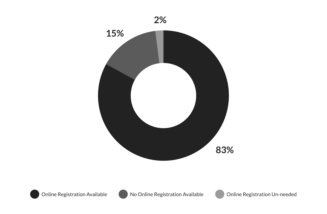
- 83% of U.S. websites offer the option for online voter registration; 15% do not provide online registration functionality, and for 2%, online registration is not required.
- 35% of U.S. websites that offer online voter registration have a high web accessibility index; 42% of those sites have a medium web accessibility index, and 23% have a low web accessibility index.
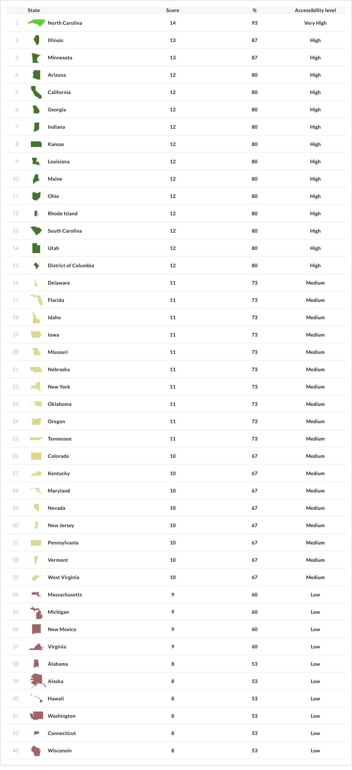
- North Carolina’s website offers the highest level of web accessibility. It scored 14 points out of 15. The only point deducted was for errors in the HTML code.
- Illinois and Minnesota come second, scoring 13 points out of 15. Two points were deducted for errors in the HTML code and missing link purposes.
- The third place is shared by 12 state election sites, such as Arizona, California, Georgia, Indiana, Kansas, Louisiana, Maine, Ohio, Rhode
- Island, South Carolina, Utah, and the District of Columbia. All of them scored 12 points.
- The state election site of Wisconsin has the lowest web accessibility score. The accessibility barriers concern non-adaptive UI, unclear error messages, no autocomplete feature for forms, missing keyboard navigation, insufficient text contrast, missing input labels, missing link purpose, and HTML errors.
- 18 U.S. sites out of 43 that offer online voter registration have a medium level of web accessibility.
- 10 U.S. sites out of 43 that offer online voter registration have low levels of web accessibility.
- 98% of online voter registration sites have HTML errors, which can interfere with the proper functioning of assistive technologies, such as screen readers. Utah is the only state website with online voter registration that has no HTML errors.
- 77% of online voter registration sites have forms with missing labels on input fields. This means the text voiced by a screen reader won’t be informative because the purpose of each field isn’t marked with a label.
- 53% of online voter registration sites have text with insufficient contrast, making reading difficult for users with visual impairments.
- 53% of online voter registration sites lack a link description, which can confuse users who rely on screen readers as the destination of the link or action required is not stated.
- HTML errors, missing labels on input fields, low-contrast text, errors not clearly marked or described, missing link purpose, no autocomplete for forms, non-adaptive UI, and improper content presentation through a screen reader are the most common access barriers.
- Compared to the findings of the 2014 report by ACLU & C4AT, many of the same access barriers have persisted throughout the years. For example, QAwerk has also documented unclear error messages, missing input field labels, errors in the HTML markup, lack of descriptive page titles, poor keyboard navigation, and color contrast issues in this accessibility report.
Methodology
This web accessibility assessment was performed by QAwerk’s team of software accessibility testers. We conducted manual and automated testing and used specialized tools to evaluate the compliance of 43 U.S. online voter registration websites with Web Content Accessibility Guidelines (WCAG) 2.2.
The websites assessed in this web accessibility testing were selected from the official list provided by Vote.gov, recognized as a reliable source of accurate and authoritative voting information from the U.S. government to the American public. The total time spent on manual testing for all 43 websites was 183 hours. The testing was initiated on August 19, 2024, and completed on September 4, 2024.
Disclaimer
This review was not a comprehensive examination of every page and detail on each site. Our focus was on identifying the most common accessibility barriers rather than cataloging every instance of such barriers. As a result, this report should not be considered a complete accessibility audit of any individual website.
While addressing the specific issues highlighted in this report would significantly improve accessibility, it is crucial to recognize that this report alone does not constitute a complete assessment of a website’s accessibility.
Additionally, since this web accessibility evaluation was done independently with no prior agreements or communication with the web admins of those sites, we assume some bugs we identified may have been fixed. At the same time, there may be other critical accessibility issues outside the scope of this report.
This report or any part of it may be reproduced, redistributed, or republished only with proper attribution to the original source, as cited: QAwerk, a software testing company.
Sample Size & Limitations
As of April 2024, 42 US states, Washington D.C., and Guam allowed online voter registration. In total, we tested 43 websites, excluding Guam.
Our testing didn’t include form submission since providing false information, such as test data, during registration may be regarded as interference and is against U.S. law.
As a result, our research was limited, and we were only able to test the half steps of the registration process for 40 websites.
However, for three state election sites, California, Delaware, and Louisiana specifically, we performed accessibility testing of the entire user flow. We compared the results from both partial and full user flows and the accessibility scores remained the same, indicating that accessibility issues can be detected in the early stages of the registration process. As a result, the final results are valid despite the testing limitations.
Testing Criteria
We selected these criteria based on WCAG 2.2 guidelines and our experience with accessibility testing for
e-government solutions:
- Adaptive Design: The content/functionality is accessible on different screens sizes (desktop, tablet, and mobile).
- Screen Reader Compatibility: The content can be presented through a screen reader without losing any information or structure.
- Autocomplete for Forms: For text input elements, the autocomplete attribute should be in place to let the user know what kind of data is expected to be entered.
- Clear Error Messages: Input errors are clearly marked and described to the user.
- Labeled Input Fields: Items requiring user input are clearly labeled or have clear instructions.
- Predictable UI Changes: Changing the settings of a checkbox, radio button, or other UI component does not trigger unexpected changes in context, such as causing significant changes to the page content or opening a new window.
- Use of Color: Color is not used as the only visual means of conveying info.
- High-Contrast Text: Text has enough contrast with the background (the contrast ratio should be 4:5:1 for small text and 3:1 for large text).
- Zoomable Content: The website can be zoomed in without losing any information or structure.
- Keyboard Navigation: All functionality is available from a keyboard, except for tasks such as drawing.
- Focus & Action Control: When a UI component receives focus, this does not trigger unexpected actions such as automatically submitting a form, opening a new window, or switching focus to another element.
- Descriptive Page Title: The page has a title describing its topic or purpose.
- Link Purpose: The purpose of each link can be determined from the link text or context.
- Defined Page Language: The language of the web page (e.g., English) is specified in the code.
- Valid HTML Code: There are no errors in the HTML and no duplicate element IDs.
Testing Tools
We believe the most accurate and comprehensive results are achieved with a combination of manual and automated testing. It also makes sense to combine both approaches from the standpoint of cost-effectiveness. Our accessibility testing team used the following tools:
- Chrome DevTools: a set of developer tools built into the Google Chrome browser. It is used for inspecting HTML elements, CSS styles, and network activity. With Chrome DevTools, one can also test how a web page’s UI adapts to different devices and screen sizes.
- JAWS: the world’s most popular screen reader. It allows simulation of the web experience of users with visual impairments.
- axe: a suite of accessibility testing tools that allow automatic scanning of whole sites and conducting comprehensive WCAG audits.
- WAVE Chrome Extension: one of WAVE’s evaluation tools that allows accessibility testing to be performed directly in a browser. It doesn’t send any information to the WAVE server, which ensures private and secure accessibility reporting.
- W3C’s Markup Validation Service: a free tool that checks the syntax of web pages written in HTML, XHTML, SMIL, and other formats.
- Siteimprove: a web accessibility checker that automatically scans web pages for deviations from WCAG guidelines. It also allows the identification of duplicate ID attribute values that may break the accessibility of labels for forms, table header cells, and other elements.
- Accessible Web Helper: a free Chrome extension that uses WCAG guidelines to scan web pages in real time. It highlights accessibility violations, including color contrast issues, and provides recommendations for improvement.
Scoring and Analysis
Each website was assigned a score based on the number of testing criteria it met. A comparative table was created to rank websites by their overall scores and interpret what implications those scores may have on the lives of users with disabilities.
Depending on the outcome, test cases were marked as “Pass” or “Fail”.
Pass:
- The website feature or element meets the standards set by WCAG 2.2.
- The feature is considered accessible and contributes positively to the overall accessibility of the website.
- A score of 1 point is assigned, contributing to the overall accessibility score.
- The score of 1 point indicates a high likelihood that a user, regardless of their abilities, can successfully use this feature.
Fail:
- The website feature or element does not meet the WCAG 2.2 standards or meets them only partially.
- The feature is considered inaccessible or presents a barrier to users.
- A score of 0 points is assigned, negatively impacting the overall accessibility score.
- The score of 0 points suggests that users may encounter difficulties when trying to use this feature.
The accessibility index is a numerical value that represents the percentage of accessibility criteria met by a website. It is calculated using the following steps:
- Count how many of the 15 testing criteria are successfully passed.
- Calculate the accessibility index: Multiply the number of criteria met by 100 and then divide by 15. This will give you a percentage value between 0% and 100%.
- Determine the website’s accessibility level based on its accessibility index.
0-4
0-27%
Very low
Successful form submission is unlikely.
5-9
33-60%
Low
Users may face substantial difficulties that require assistance from another person.
10-11
67-73%
Medium
Users may need to make multiple attempts to submit the form successfully, and in some instances, external support may be necessary.
12-13
80-87%
High
Most users with disabilities are likely to submit the form successfully.
14-15
93-100%
Very High
The chance of a successful form submission is very high. Users experience no or insignificant difficulties throughout the process.
Top 8 Accessibility Issues & Best Practices
This section provides a more detailed overview of the most common accessibility issues in the U.S. online voter registration sites. The issues are ordered from most to least common, regardless of their significance.
Valid HTML code
98
42
1
Labeled input fields
77
33
10
High-contrast text
53
23
20
Link purpose
53
23
20
Clear error messages
44
19
24
Autocomplete for forms
40
17
26
Adaptive design
23
10
33
Screen reader compatibility
14
6
37
1. HTML Errors
Valid HTML code is more likely to be rendered correctly across different web browsers and devices, leading to a consistent user experience. Also, valid HTML markup makes it easier for assistive technologies, such as screen readers, to interpret and understand the content of a web page.
Only one website out of the 43 we tested had no errors in its HTML code. This was Utah. To ensure a web page has no HTML errors, one can use a markup validation service, such as W3C validator. Here is a screenshot from this tool showing eight errors found in the HTML markup of the Oklahoma online voter registration site.
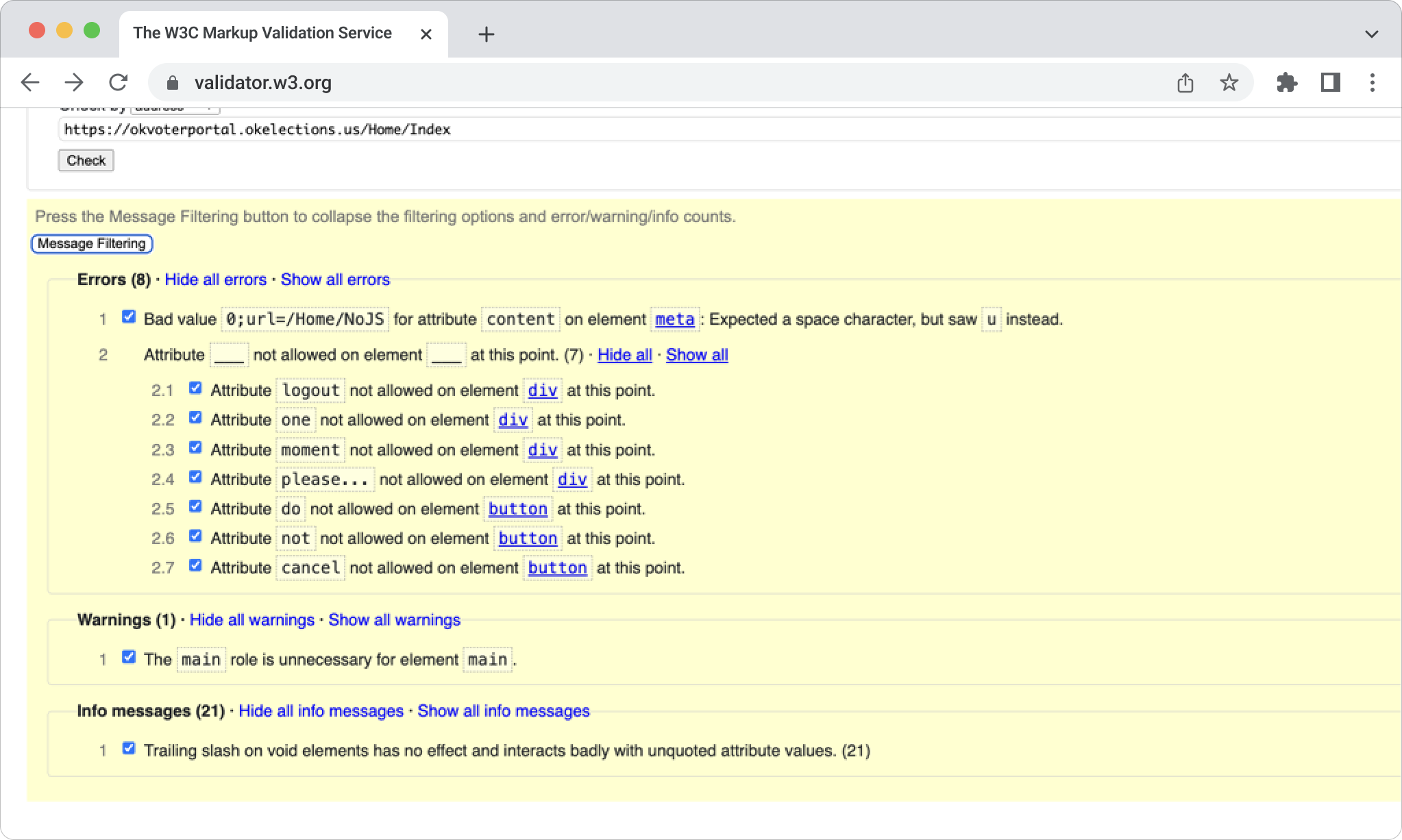
But how do these errors affect web accessibility? Invalid or incorrect attributes (like logout, one, and moment) on HTML elements can confuse screen readers. These technologies rely on proper HTML semantics to interpret and convey the structure and content of the web page to users with disabilities.
Suppose elements like buttons or headers are incorrectly marked with invalid attributes. In that case, screen readers may not recognize them as actionable or interactive components, leading to confusion for users trying to interact with these elements.
Best Practices:
- Regularly validate HTML code using tools like the W3C Markup Validation Service or axe DevTools
- Use browser add-ons like Firebug for quick HTML validation during development
- Incorporate HTML linters into your development environment: these tools automatically check for errors and stylistic issues as you write code, providing immediate feedback
- Use unique IDs: no two elements on the same page should have the same ID
- HTML5 is recommended because it is a lot more forgiving than previous versions of HTML
- Follow web standards and best practices and enforce them through code reviews
- Implement automated testing to check for various aspects of web quality, including HTML validation, accessibility, and performance
2. Missing Labels on Input Fields
Labels help screen readers announce the purpose of each field to visually impaired users. Without labels, they may be unable to complete the form accurately. For example, a screen reader user might hear “name” for an input field, but if the label is missing, the user might only hear “input,” leading to confusion about the required information.
Only 10 websites out of the 43 we tested had no issues labeling input fields. These were Illinois, Kansas, Arizona, Michigan, Minnesota, Nebraska, New York, North Carolina, Ohio, and the District of Columbia.
With browser extensions like WAVE, organizations can automatically scan their websites for various accessibility issues, including missing labels on input fields. Here is a screenshot from this tool highlighting accessibility issues of the New Jersey online voter registration site.
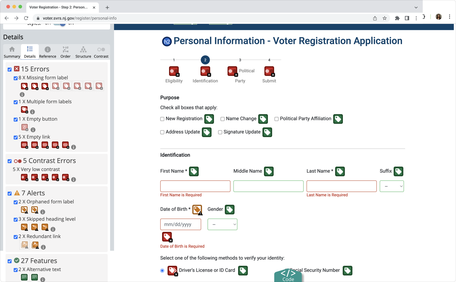
We can see eight input fields and one button without labels. Also, one element appears to have multiple labels, which can confuse assistive technologies. Two form labels are orphaned, meaning labels are present but not properly associated with their corresponding input fields. Missing labels alone (but there are also missing links and skipped headings) can make filling out forms for screen reader users extremely difficult and time-consuming.
Best Practices:
- Clearly label all fields and other form elements, or provide instructions for correct entry
- Use the
- Use concise, descriptive, and unambiguous language
- Use placeholder text to complement, but not replace, a proper label
- Identify mandatory fields with a text label. Do not use color or images only to identify required fields
- Display the label for an element in close proximity to that element
- Provide examples of correct input, such as the correct date format
- Test your forms on different browsers, devices, and with screen readers to ensure everything functions as expected for a wide range of users
- Use automated tools (like WAVE, axe) and manual testing with screen readers to identify and fix accessibility issues
- Conduct usability testing with individuals who have disabilities
3. Low-Contrast Text
The text should have enough contrast with its background so that it can be read by people with moderately low vision or impaired contrast perception without using contrast-enhancing assistive technology.
According to WCAG 2.2, the minimum contrast requirements are as follows: the visual presentation of text and text images has a contrast ratio of at least 4.5:1; large-scale text and images of large-scale text have a contrast ratio of at least 3:1.
53% of the U.S. websites that offer online voter registration have insufficient color contrast on their forms.
Color contrast ratios can be checked with Chrome browser extensions like WAVE or Accessible Web Helper. Here is a screenshot from the latter, pinpointing low-contrast issues of the Maryland online voter registration site.
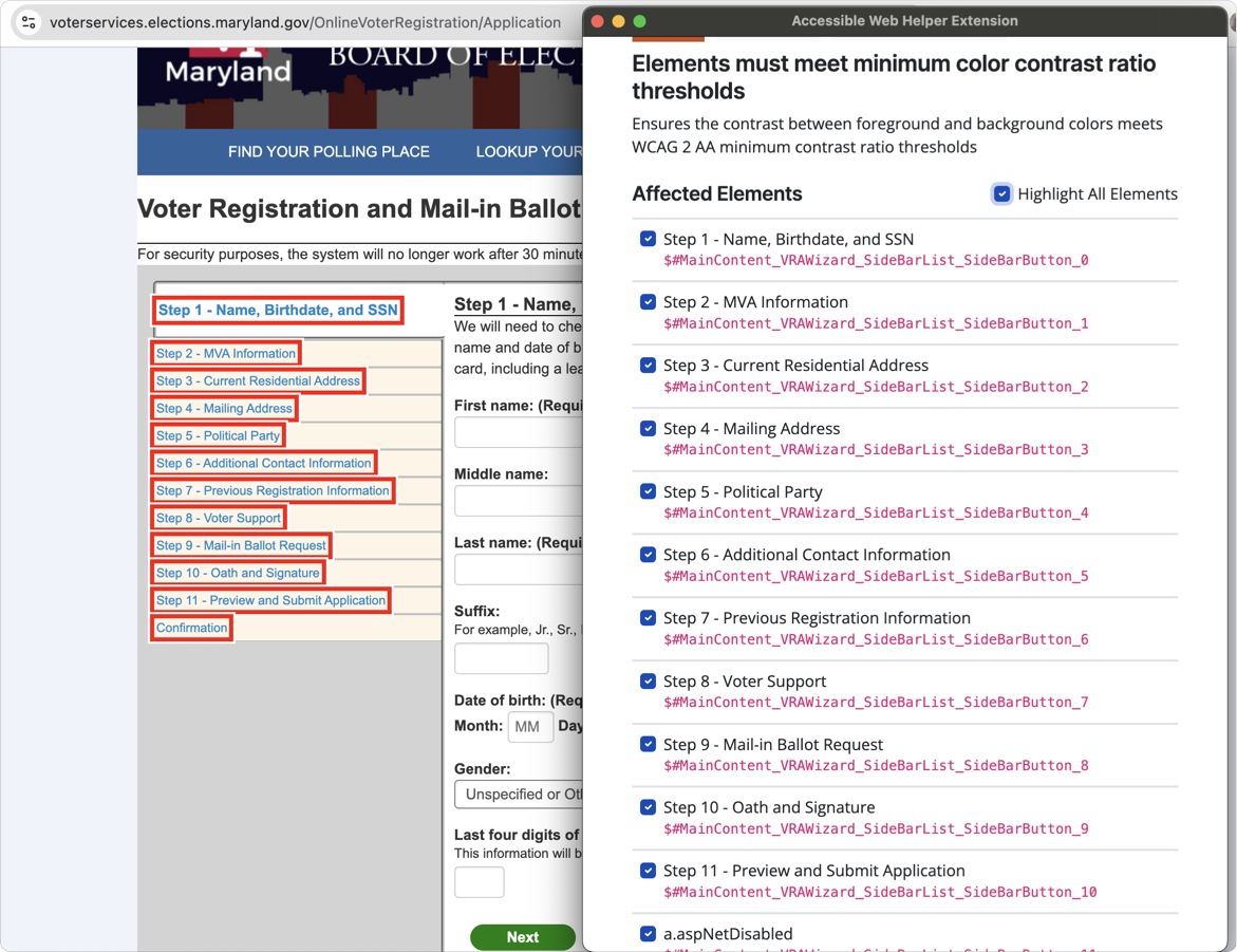
All steps on the form have insufficient color contrast between the text and background. This issue could make it difficult for users with low vision or color blindness to distinguish the text, especially in the side navigation.
Best Practices:
- Follow the latest WCAG contrast guidelines
- Use contrast-checking tools like WAVE, Accessible Web Helper, or WebAIM’s Contrast Checker
- Use darker shades of text for light backgrounds or light text for dark backgrounds
- If using background images, ensure that the text overlaid on the image has sufficient contrast
- Allow users to switch between different contrast themes (like a “high contrast mode”) to accommodate diverse needs
- For contrast purposes, make sure the text is legible for those who are color blind (such as those with red-green or blue-yellow color blindness)
- Use sufficiently large text sizes as they naturally improve readability
4. Missing Link Purpose
Users should be able to understand what each link will do. Whenever possible, provide link text that identifies the purpose of the link without needing additional context. Screen readers can list all the links on a page, so meaningful link text helps users choose the right one. It’s also helpful for those who navigate using the tab key.
More than half of the U.S. online voter registration sites contain poorly labeled links. Take the Massachusetts state election site, for example.
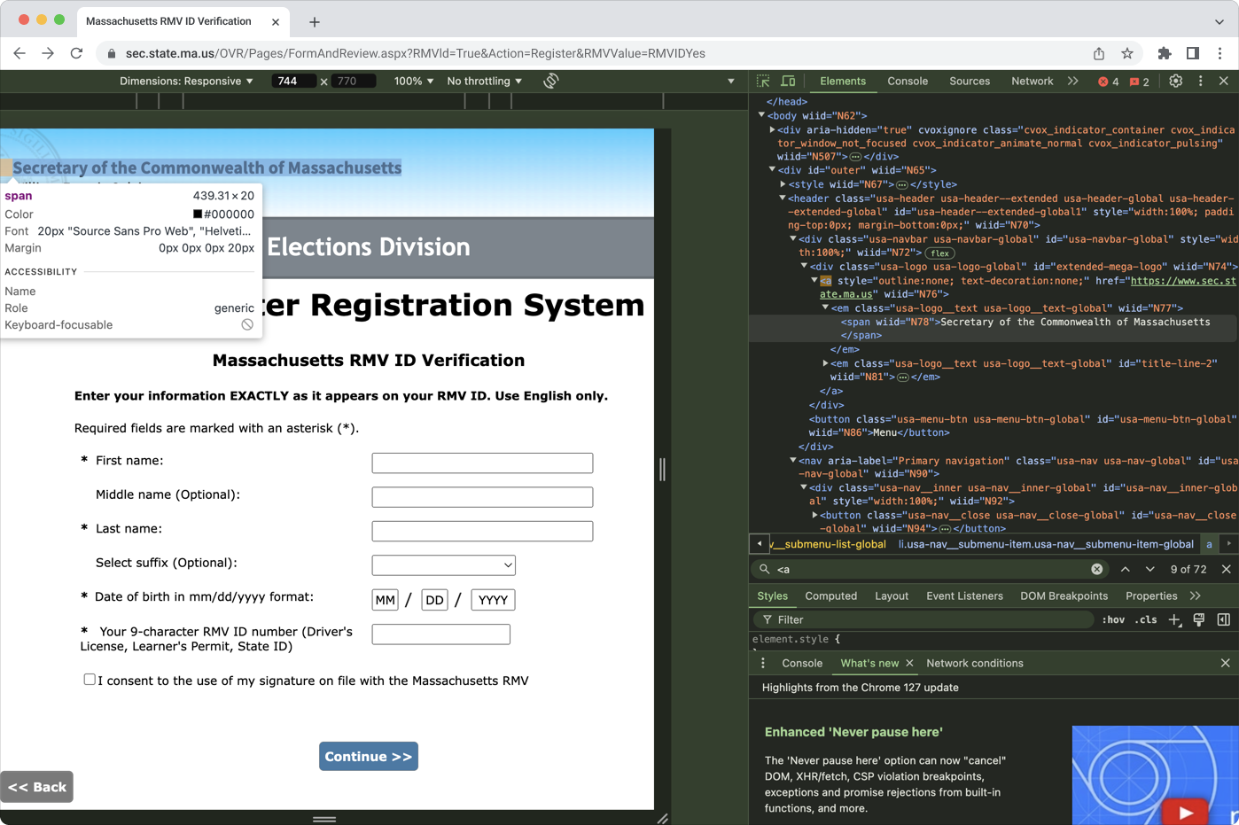
Here, the text “Secretary of the Commonwealth of Massachusetts” contains a link, but there’s no description of its destination or action required. Also, assigning a generic role for interactive elements like links could reduce clarity for users who rely on screen readers.
Best Practices:
- Ensure the purpose of each link is evident from the text (label) of that link or from the sentence in which the link appears
- Use descriptive link text that makes sense even out of context
- When the link text or context is not clear enough, give the link a title property with a clear description of the link purpose or target, e.g., a href=”page.html” target=”_blank” title=”View more details about this person (opens in a new window)”>John Smith </a>
5. Errors Not Clearly Marked or Described
When an error occurs, users should be informed and provided with clear guidance. For unsuccessful form submissions, simply re-displaying the form without explanation is insufficient. If a form submission fails, users may abandon the process due to uncertainty about how to fix the error, even if they know one exists. That’s why the error must be clearly communicated in text.
If possible, offer specific suggestions for correcting input errors. This includes information that is missing, doesn’t meet the required format, or falls outside the allowed values. Providing clear instructions helps users with learning disabilities, visual impairments, and motor disabilities complete forms more efficiently.
Unclear error messages are present in 44% of online voter registration sites. The Delaware state election site contains this accessibility issue.
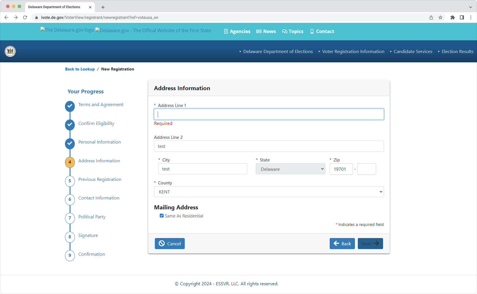
Here, the user’s error isn’t clearly marked or described. Only the word “Required” indicates that the field is mandatory. The borders of the field are not highlighted in red.
Best Practices:
- Implement client-side validation to provide immediate error alerts through dialog boxes when users enter invalid data
- Implement server-side validation to re-display the form with error messages, clearly indicating the nature of the error and providing guidance for locating the problematic fields
- Provide examples of the correct data entry for the field, such as the accepted date format
- Use color or images in addition to the text to mark the form elements containing errors
6. Missing Autocomplete for Forms
Users with cognitive disabilities may benefit from autocomplete features, as it reduces the mental effort required to recall and input information. For users with limited mobility or fine motor skills, autocomplete can help speed up the form-filling process, reducing frustration and fatigue.
Screen reader users can benefit from autocomplete suggestions, as it provides context and reduces the need to type out information manually.
Sadly, 17 U.S. websites for online voter registration do not have this feature. California’s site is one of them.
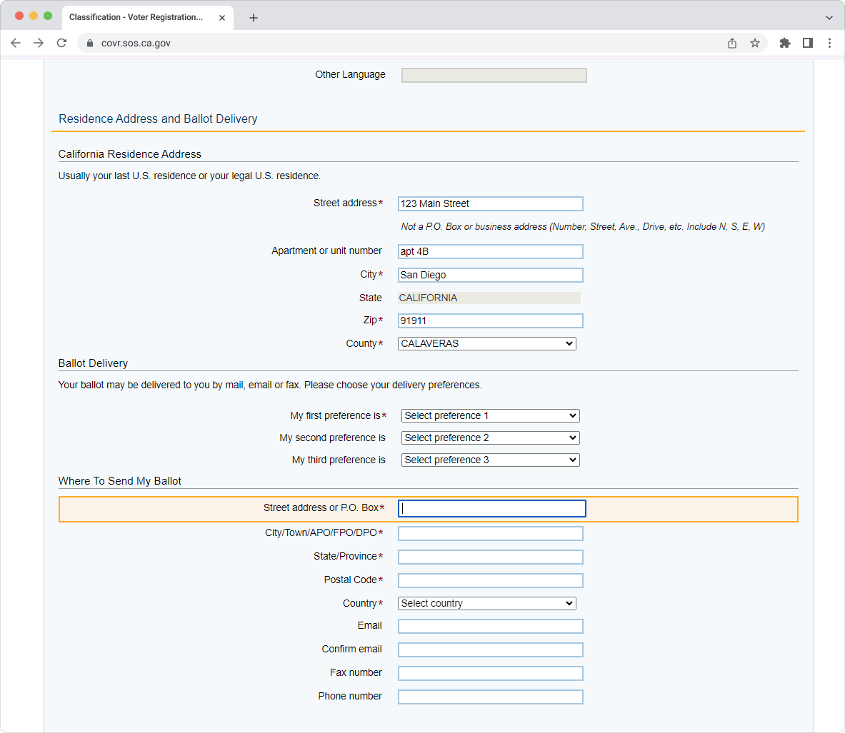
Here, we can see that the user already mentioned their street address, but one more field requires the same or similar information. The field is not auto-populated.
Best Practices:
- Offer users a clear choice to turn on or off autocomplete functionality
- Ensure the form field has a valid and well-formed autocomplete attribute and value pair: This means that the form field correctly tells the browser what kind of information it expects (<input autocomplete=”name”>)
- Ensure the purpose of the form field indicated by the label corresponds with the autocomplete token on the input: This means that the label for the form field matches the type of information the browser is expecting
- Avoid using autocomplete for data about other people
- Verify that autocomplete functions as expected across various browsers and devices
7. Non-Adaptive Design
Adaptive design is essential to meet the four principles of accessibility. According to WCAG 2.2, UI components should be perceivable, operable, understandable, and robust. If at least one of the conditions is not met, users with disabilities may encounter barriers to using the web. Non-adaptive design makes user interfaces impossible or highly difficult to operate and understand.
Also, it’s important not to lock content to either portrait or landscape presentation. Some users have their devices mounted in a fixed orientation, such as on the arm of a power wheelchair. Therefore, they can’t rotate their devices if the content is restricted to a particular orientation.
People use a variety of devices, from large desktop computers to small smartphones. Adaptive design ensures everyone can access the content and functionality they need, regardless of their device. The online voter registration sites in Washington, Wisconsin, Kentucky, Maryland, Massachusetts, Nevada, New York, Vermont, New Mexico, and Connecticut have a non-adaptive UI design.
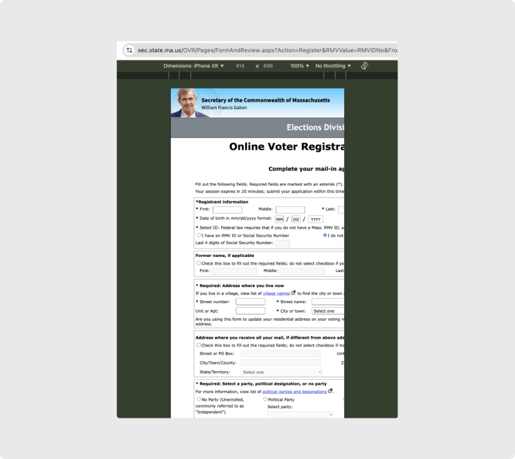
The UI of the Massachusetts portal for online voting doesn’t adjust the UI based on the user’s screen size, making it troublesome, if not impossible, to submit a form on a range of mobile devices.
Best Practices:
- Ensure that the website adapts its UI to a range of popular desktop and mobile devices
- Check if navigation across different screen sizes is consistent, predictable, and accessible
- Design layouts that allow content to reflow to fit smaller screens (like mobile phones) without the need for horizontal scrolling
- On small screens, ensure that the order of content remains logical and that users can navigate through elements (especially interactive ones) in a clear, predictable sequence
- Use images that can scale and adjust to different screen sizes without losing clarity; use percentage-based dimensions for media elements rather than fixed pixel sizes
- Ensure that interactive elements like buttons, links, and form controls are large enough to be easily tapped or clicked on touchscreens
- Do not lock the content orientation to only portrait or landscape
8. Improper Content Presentation Through Screen Readers
Users with screen readers can navigate and understand content more effectively when it’s designed with accessibility in mind. That’s why ensuring the content doesn’t lose any information or structure when presented through a screen reader is so important.
Six online voter registration sites, such as Virginia, Hawaii, Colorado, Iowa, Kansas, and Alabama, have issues when browsed with a screen reader. These issues vary from parts of the content and input format examples not voiced to content not accessible by keyword navigation and missing visual cues during the voice-over.
Best Practices:
- Ensure users can understand the correct order of the information presented without relying on the visual layout of the page
- Ensure users are not required to identify elements solely by shape or position on the page. For example, these are not helpful: “the button on the right,” “the left-hand sidebar,” “the round button,” “the sounds that chimes”
- Identify elements on the screen by multiple characteristics, such as the label, color, and position, e.g., “the green button ‘Next’ on the right”
- When using beeps or other sound cues to inform the user of an event, display a textual message as well
State vs. State Review: The Leader and the Laggard
Here, we break down the results of our accessibility testing for two states: the one with the highest score and the one with the lowest. North Carolina showed the highest level of web accessibility, whereas Wisconsin scored the lowest.
If you need access to a full state-by-state review and all appendices, please get in touch with our PR Manager Helen at helenpr@redwerk.com.
North Carolina
The North Carolina online registration website has received the highest web accessibility score in our testing, earning 14 out of 15 points. The only issue identified was the presence of HTML errors, specifically non-unique element IDs.
Adaptive design
Pass
–
Screen reader compatibility
Pass
–
Autocomplete for forms
Pass
–
Clear error messages
Pass
–
Labeled input fields
Pass
–
Predictable UI changes
Pass
–
Use of color
Pass
–
High-contrast text
Pass
–
Zoomable content
Pass
–
Keyboard navigation
Pass
–
Focus & action control
Pass
–
Descriptive page title
Pass
–
Link purpose
Pass
–
Defined page language
Pass
–
Valid HTML code
Fail
Errors are present in the HTML code.
Access Barriers
Issue: Errors are present in the HTML code.
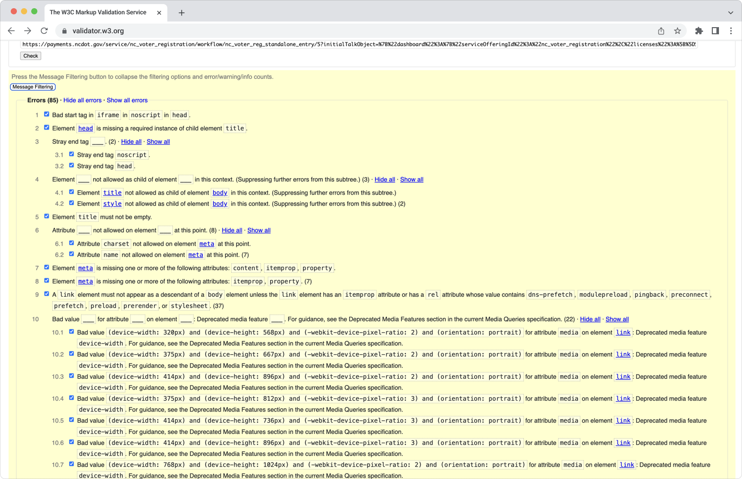
Here, the HTML validation tool identified deviations from the standard markup. For example, an <iframe> element is used within a <noscript> element, which is not supported in HTML. This could lead to incorrect rendering or behavior. If the <iframe> contains important content, users with JavaScript turned off may be unable to access it.
Another issue is stray end tags: extra closing tags do not correspond to opening tags. These errors can disrupt the document tree, which assistive technologies rely on to correctly navigate and interpret the content. There are 85 errors like these in total.
Wisconsin
Wisconsin received the lowest web accessibility score in our evaluation, achieving only 7 out of 15 points. The website exhibits substantial access barriers to online voter registration and requires significant improvements to ensure equitable registration opportunities for all users.
Adaptive design
Fail
The website doesn’t have an adaptive layout and content presentation to different screen sizes and orientations.
Screen reader compatibility
Pass
Autocomplete for forms
Fail
The autocomplete feature is not available to the user.
Clear error messages
Fail
Input errors are not clearly described to the user.
Labeled input fields
Fail
The items requiring user input aren’t clearly labeled or don’t have clear instructions.
Predictable UI changes
Fail
The button cannot be accessed using the keyboard.
Use of color
Pass
High-contrast text
Fail
Some elements, such as buttons, don’t have a high enough contrast ratio.
Zoomable content
Pass
Keyboard navigation
Pass
Focus & action control
Pass
Descriptive page title
Pass
Link purpose
Fail
Links do not have appropriate labels.
Defined page language
Pass
Valid HTML code
Fail
Errors are present in the HTML code.
Access Barriers
Issue 1: The website doesn’t have an adaptive layout and content presentation to different screen sizes and orientations.
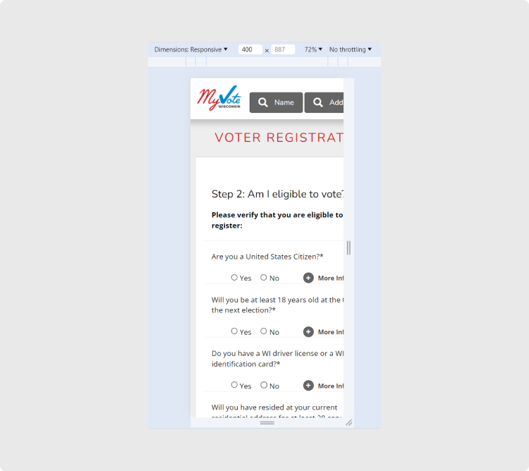
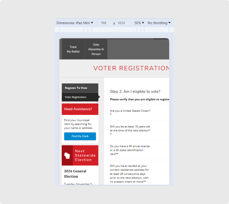
Here, we see that part of the online voter registration form is cut off when the website is accessed via a smartphone or tablet. People with disabilities should be able to register online regardless of their device, especially given that modern gadgets offer built-in assistive technology, such as TalkBack on Android and VoiceOver on iOS.
Issue 2: The autocomplete feature is not available to the user.
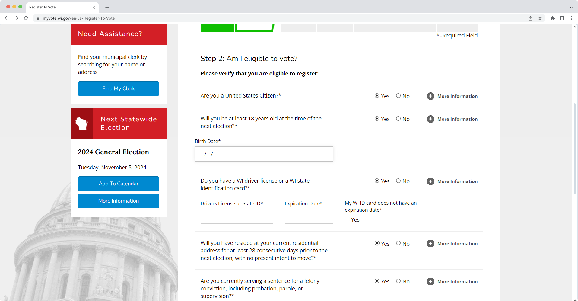
Here, the user provided the date of birth earlier when verifying that they are not registered and can proceed. However, when the cursor is placed in the field, there is no autocomplete suggestion. The autocomplete attribute helps browsers predict and suggest field values based on past inputs.
Issue 3: Input errors are not clearly described to the user.
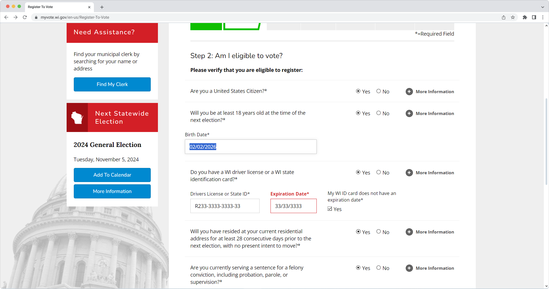
The user should get suggestions on how to resolve errors. Here, the error is only marked as a required field, with no information on what’s wrong.
Issue 4: The items requiring user input aren’t clearly labeled or don’t have clear instructions.
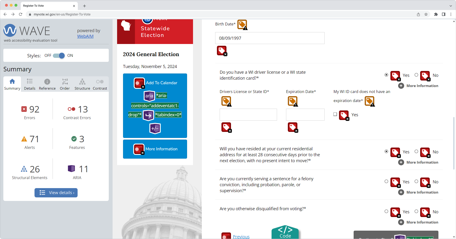
Here, certain fields and radio buttons do not have corresponding labels. In addition to those red icons, yellow ones indicate orphaned form labels. That means the label is present but is not correctly associated with the form control.
Issue 5: The “Continue to Step 2” button cannot be accessed using the keyboard.
Issue 6: Some elements, such as buttons, don’t have a high enough contrast ratio.
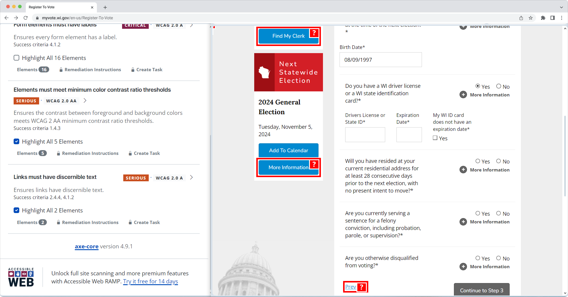
The foreground and background colors of some buttons do not meet WCAG 2 AA minimum contrast ratio thresholds.
Issue 7: Links do not have appropriate labels.
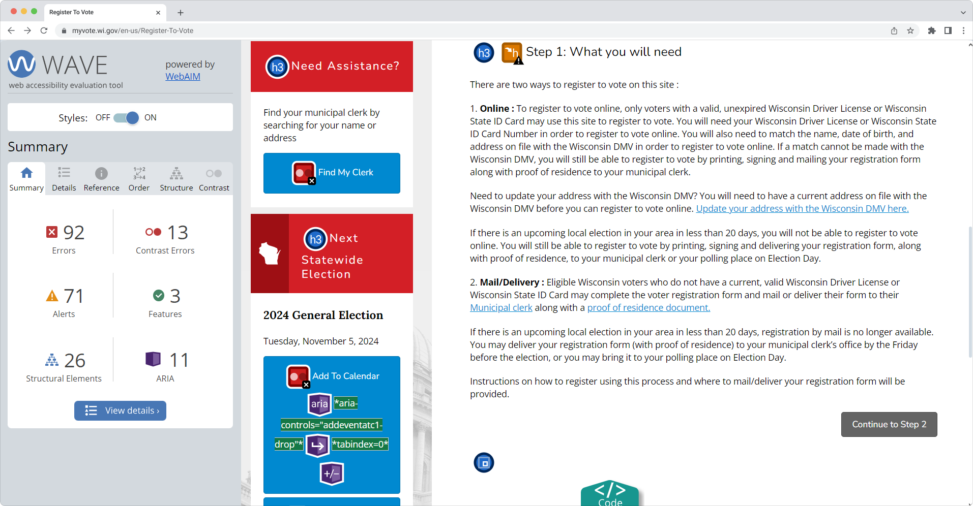
Here, the links that contain vital information about where one can update their address and how to register to vote by mail have no labels. Without text labels, screen reader users may have difficulty understanding the link’s purpose or destination.
Issue 8: Errors are present in the HTML code.
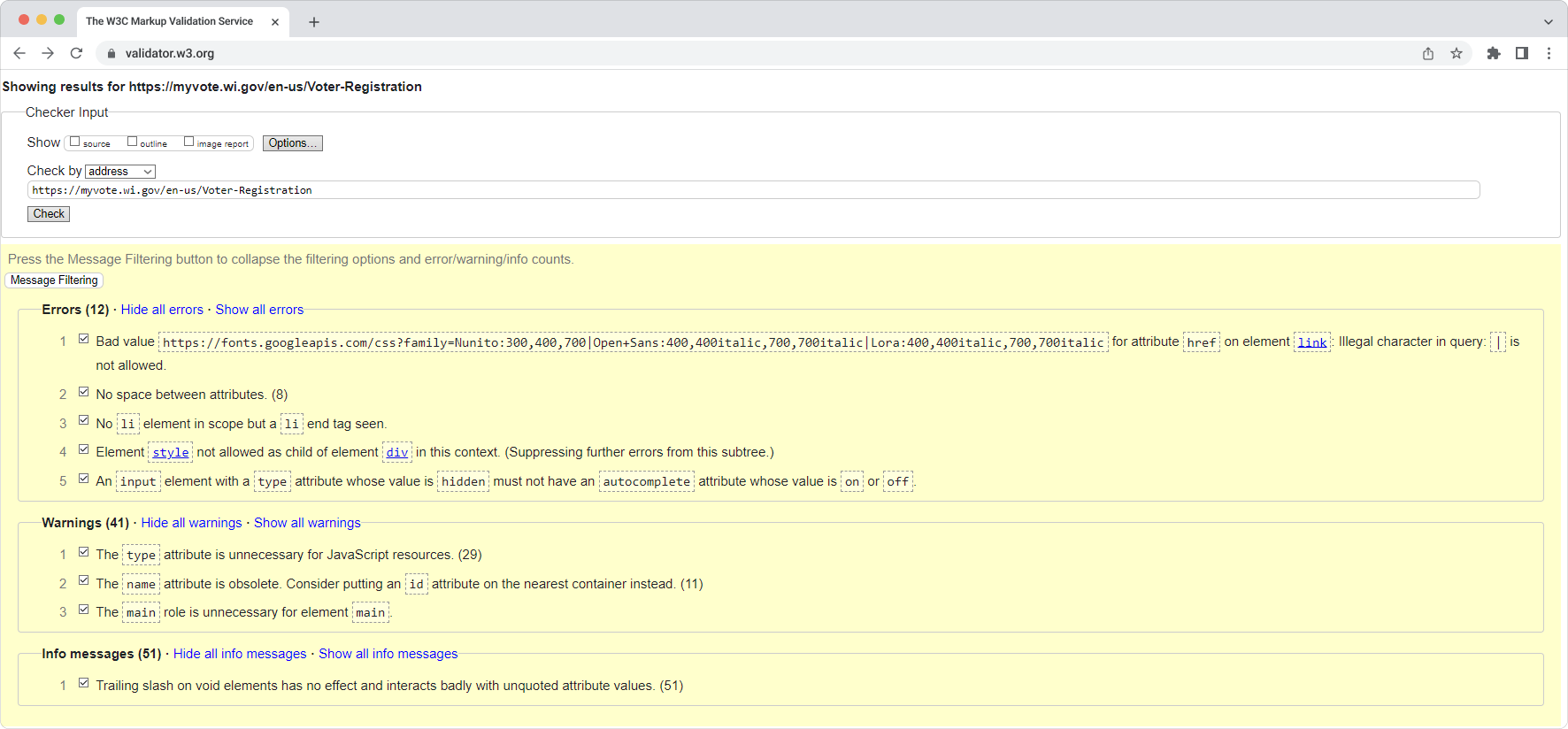
This screenshot illustrates several errors in the HTML markup. For example, there’s missing space between attributes. For assistive technologies like screen readers, this can create navigation problems, as these tools may interpret improperly formatted code incorrectly. A missing <li>element could disrupt the logical structure of the content, making it more difficult for users with cognitive impairments or screen reader users to understand the relationship between items in the list.
Looking at all the issues we found on the Wisconsin state election site, we conclude that users with disabilities may find it unusable to register online or source information on the election process. Due to the limitations of the site, they might need external support to navigate and successfully submit the form.
Conclusions & Recommendations
Our analysis of online voter registration websites in the United States has revealed that while many sites have made strides towards accessibility, significant challenges remain. Common issues such as missing labels, unclear error messages, and insufficient text contrast continue to hinder the ability of users with disabilities to exercise their rights and register online.
To improve the accessibility of online voter registration sites, we recommend the following:
- Adherence to WCAG 2.2 Standards: State election sites should strive to meet the requirements of the Web Content Accessibility Guidelines (WCAG) 2.2, particularly at the AA level. This includes ensuring that content is perceivable, operable, understandable, and robust.
- Regular Accessibility Testing: Websites should be regularly tested using automated tools and manual evaluation techniques to identify and address accessibility issues.
- Involvement of Users with Disabilities: State election offices should collaborate with individuals with disabilities to gain insights into their experiences and identify specific barriers to accessibility.
- Prioritization of Accessibility: Accessibility testing should be considered a core component of the website development and maintenance process rather than an afterthought.
- Training and Education: Staff should receive training on web accessibility best practices to ensure they understand the importance of creating inclusive digital experiences.
“By embedding accessibility within the software or product development from the outset, organizations can establish an effective and sustainable accessibility program. Only a holistic approach like this, coupled with strong accessibility policies that mandate ongoing employee training and web accessibility evaluation, can guarantee consistent progress and satisfactory results,”
Accessibility should be an ongoing effort. Websites must be retested regularly, especially as they get updated and new content is added. To achieve a truly inclusive experience, a more thorough evaluation—conducted by independent testers and real users with disabilities—is needed. This will help reduce frustration and stress so more people can vote with ease and dignity.
About QAwerk
QAwerk is a software testing company with extensive experience in web accessibility testing, ensuring that digital platforms are user-friendly and accessible to all, including individuals with disabilities. We offer a comprehensive suite of software testing services, from functional and regression testing to load and accessibility testing, with test automation included.
We are trusted by global innovators like Squarespace, ClickHouse, and Evolv. Over 300 projects across North America, Australia, Europe, South Korea, and Africa have achieved next-level quality with our software testing services.
Ranked as one of the best quality assurance service companies worldwide by IAOP (“Global Outsourcing 100”), we help businesses elevate their products’ quality, release updates faster, and attract more consumers.
Sources
Mizner, S. & Smith, E. (2015). Access denied: Barriers to online voter registration for citizens with disabilities. EAC. https://www.eac.gov/sites/default/files/event_document/files/021915-aclu-voterregonline_01.pdf
National Council on Independent Living. (2018). Achieving accessibility for election websites
and sample ballots: A toolkit for disability advocates. https://www.ncil.org/wp-content/uploads/2018/11/Sample-Ballot-Toolkit.pdf
Schur, L., Kruse, D., Ameri, M., & Adya, M. (2023). Disability and voting accessibility in the 2022 elections. EAC. https://www.eac.gov/sites/default/files/2023-07/EAC_2023_Rutgers_Report_FINAL.pdf
Tan, A. & Yoder, K. (2024). The expansion of innovative voter registration methods, 2000–2024. https://electioninnovation.org/research/expansion-voter-registration-methods/
The Pew Charitable Trusts. (2015, May 13). Online voter registration: Trends in development and implementation. https://www.pewtrusts.org/en/research-and-analysis/issue-briefs/2015/05/online-voter-registration
U.S. Department of Justice. (2020, February 28). Accessibility of state and local government websites to people with disabilities. https://www.ada.gov/resources/accessibility-govt-websites/
U.S. Department of Justice. (2024, May 22). Accessibility of web content and mobile apps provided by state and local government entities: A small entity compliance guide. https://www.ada.gov/resources/small-entity-compliance-guide/
World Wide Web Consortium. (2023, October 5). Web content accessibility guidelines (WCAG) 2.2. https://www.w3.org/TR/WCAG22/
