As mobile Internet is getting more used, the websites need to get more suitable for the users. Responsive web design (RWD) might help in meeting this demand.
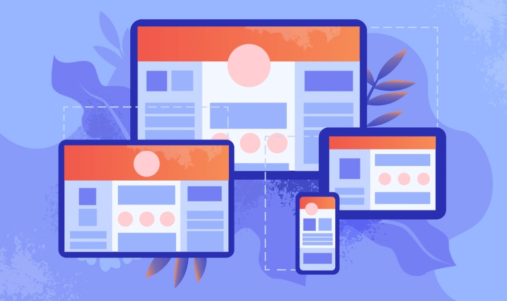
Responsive Web Design Definition
Responsive web design is part of website QA aimed at creating a website suitable for working on any device with any screen size. The priority is to ensure an intuitive and enjoyable experience for users, no matter if they use desktop or mobile devices.
Responsive vs. Adaptive Web Design
Another approach to creating websites that are easily adaptable for different types of devices is adaptive web design (AWD). It is a set of design methods based on the practice of using various devices, not the browser itself. It is implemented by imposing certain sizes, CSS and JavaScript codes.
Both responsive and adaptive design are alike in allowing sites to be adapted to mobile devices and various screen extensions, ultimately providing mobile device users with better capabilities. At the same time, they differ in their structure.
Responsive design is a design that can change and adapt to any screen size, regardless of the device. It uses media queries to change styles based on such parameters as screen type, width, height, etc. Although, only one of these parameters is really necessary to adapt the site to different screens. Adaptive design uses static layouts built on control points: the screen size is determined first and then the corresponding layout is loaded for it.
Responsive Web Design Components
The main feature of responsive web design is that due to a fluid grid, the layout automatically responds to screen resizing. That is due to its main three technical ingredients:
- Flexible layouts (fluid grid);
- Flexible media;
- Media queries.
Layout flexibility is based on the use of relative units of measurement instead of fixed pixel values, which allows adjusting the width in accordance with the available space to fit content into the screen of a device.
Media flexibility is based on adapting the media content to match device specifications. Depending on the container that is displaying the image, they either shrink or expand.
Media queries are used to change styles based on device characteristics associated with the display of content, including type, width, height, orientation, and screen resolution. Media queries basically create a responsive design in which appropriate styles are applied to each screen size.
How to Test Responsive Web Design
The primary goal of responsive web design testing is to ensure satisfactory user experience regardless of the desktop or mobile screen. The website has to operate on different devices, platforms, and web browsers, which is becoming harder and harder to achieve due to a huge amount of new features, such as finger swipes, tapping, hovering, scrolling, and many more, that have to be tested. Besides, different devices have different screen resolutions, which adds to a challenge.
There are two types of tools that are used for responsive design testing: browser-based and standalone.
- A browser-based tool is for checking the website’ response through changing the viewport based on the device’s resolution and size;
- Flexible media;
- A standalone tool is for responsive testing the web content’ responsiveness in a device.
Testing for desired screen sizes through pixels is also possible via all browsers as they offer the necessary plugins or extensions. Chrome also provides software programs to help in modifying the screen and the environment according to the requirements of the device.
For the website to offer responsive design, RWD testing process has to ensure:
- The URL or link is the same for all devices and all browsers;
- The content location is dynamic when the screen resolution changes;
- The images have a specific resolution to be compatible with mobile or desktop devices;
- The windows are resized to allow dynamic content change.
Checklist for Responsive Web Design Testing
Here are some of the most important points you should consider when testing your responsive web design:

Tools for Responsive Web Design Testing
Now, when you know what you should check, let’s move to the actual tools that will help you in the process.
 Responsinator
With Responsinator, you just have to enter your site’s URL to test its responsive design. The main advantage of this tool is its simplicity. It allows you to interact with your page easily, just by clicking on links, using search fields, etc.
 Google DevTools Device Mode
DevTools’ Device Mode is a tool for the Chrome browser. You can use it to see how your site looks on different screen sizes and resolutions, including Retina displays. Besides, the tool allows simulating device inputs within the emulator.
 Screenfly
Screenfly allows testing a website on different devices of various screen sizes. You just have to enter your URL, choose your device and screen size from the list and see how well your website is performing.
 Material design
Material Design allows you testing your site’s design just by entering your site’s URL on its home page. You will see your pages’ design on different screen types. The tool also offers educational materials to help you learn more about Responsive Web Design.
 Ghostlab
Ghostlab is a paid-for tool that allows website testing on multiple browsers and mobile devices at the same time. It also offers software packages for different platforms, including Windows and Mac. Besides, the tool provides educational video on its home page.
Tips for Responsive Web Design Testing
Here are some tips you can benefit from when testing your website design on being responsive and mobile-friendly:

