In today’s competitive landscape, a visually consistent website design is an absolute must-have to deliver exceptional user experiences. With so much online content, users are more likely to stay on your website and engage with your brand if they feel comfortable and familiar with the design. That’s why achieving visual consistency in web design is essential and can make all the difference in creating a loyal user base.
This UI testing checklist will guide you through an in-depth user interface testing process. Our focus extends beyond just the visual aspects; we also emphasize accessibility standards and compatibility, ensuring an inclusive digital experience for all users.
Step-By-Step UI Testing Manual
Operating since 2015, we help businesses deliver flawless experiences through deep QA expertise spanning different testing types, including web UI. Here’s our take on comprehensive UI testing.
Layout and Design
For a user interface to excel, it must offer a consistent and captivating experience across diverse devices and contexts. In this part, we will explore how to test layout and design to ensure high quality of your website interface.
Visual Consistency:
- Use browser developer tools or color picker extensions to check UI colors and ensure they match the hex/RGBA codes from the design specifications
- Compare the font usage against the one mentioned in the style guide
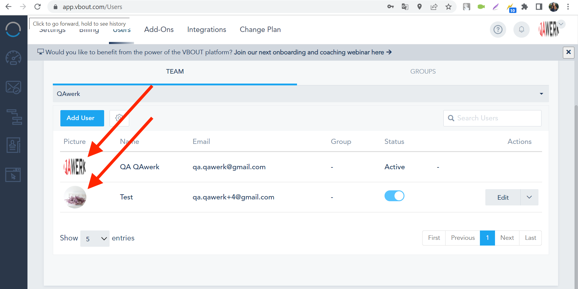
- Verify the consistency of visual elements like icons, buttons, and menus across different pages or sections
- Assess the use of typography, ensuring consistent sizing, line height, and font styles throughout the application
- Confirm that all hover and active states for clickable elements match the design specifications
- Utilize browser developer tools like Chrome DevTools to inspect elements and ensure they align with the intended grid system
- Measure the spacing and padding of elements using tools such as PixelPerfect or built-in browser rulers to confirm adherence to design specifications
- Check the alignment of text and other elements within containers to ensure consistent positioning across various screen sizes
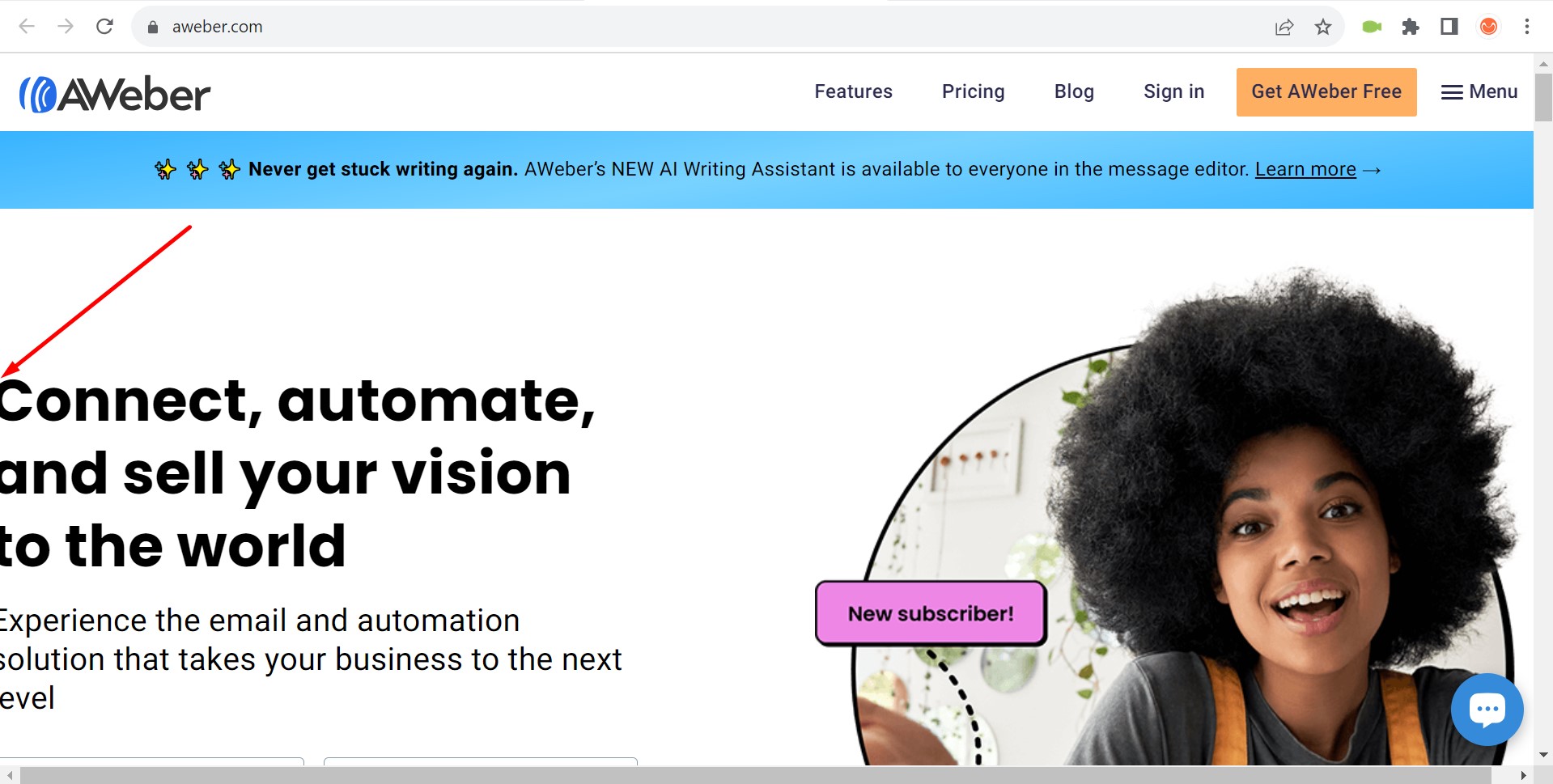
- Validate the visual hierarchy through the use of whitespace and layout arrangements
- Ensure that elements like headers, footers, and sidebars maintain consistent alignment and spacing across different pages
Responsive Design and Scalability:
- Manually resize the browser window and use responsive design mode in browser tools to test the UI at predefined breakpoints
- Test element scalability by zooming in and out, and checking if media queries trigger the correct layout changes
- Dynamically adjust the amount of content on pages and monitor layout adaptability and element behavior under different content loads
- Insert excess content to test for proper overflow handling and validate that scrollbars appear where designed
- Test the UI in device emulators like BrowserStack or LambdaTest to ensure the layout adapts correctly to different screen sizes and orientations
- Ensure images are optimized for size and format, not pixelated or broken
- Inspect elements to check the actual aspect ratios and compare them with the expected values to ensure proper display
- Simulate user interactions to test buttons and controls, ensuring visual feedback is as per design mockups
- Visually inspect and compare tables and lists against design mockups for alignment, header placements, and list item spacing
- Ensure that icons and vector images scale properly without losing quality across different resolutions and devices
Navigation
To elevate user satisfaction, a user interface must offer effortless and intuitive navigation, irrespective of the device or context. Here are all aspects that you need to check during navigation testing.
Interactive Elements:
- Check each link to ensure it directs to the correct page
- For automation, use Selenium WebDriver to script the navigation and confirm the URLs. This includes verifying internal links within the site and ensuring they lead to the correct pages or anchors
- Confirm that external links open in new tabs where appropriate. This helps maintain the user’s navigation flow and allows easy return to the original site
- Evaluate the behavior of links in different contexts. For instance, links within modals, pop-ups, or dynamic content sections should be checked for correct functionality
- Use the ‘Tab’ key to navigate through the page to ensure a logical sequence. Tools like axe can automatically test tab order and highlight focus issues
- Test keyboard shortcuts, if any, for their functionality and ensure they do not conflict with default browser or assistive technology shortcuts
- Check that all interactive elements are reachable and usable with a keyboard, without requiring a mouse
- Confirm that modal windows and pop-ups can be navigated through and closed using the keyboard
- Verify keyboard navigation for new dynamic content like AJAX-loaded sections or modal dialogs that may appear after initial page load
Mobile Navigation Adaptability:
- Employ mobile emulation in Chrome DevTools to verify touch targets are of adequate size and spaced to prevent errors
- Use emulators or real devices to ensure that side menus and other off-canvas elements work correctly with touch gestures
- Test the responsiveness of drop-down menus and ensure they are easily navigable on touch devices
- Confirm that all clickable elements are easily tappable on various mobile devices and do not require zooming in
- Evaluate swipe gestures for navigational elements like carousels or sliders on touch screens
Breadcrumbs Integrity:
- Manually confirm that the breadcrumb trail accurately reflects the user’s journey
- Use automated scripts to verify dynamic breadcrumbs update correctly when navigating
- Simulate user navigation in test automation frameworks like TestCafe to ensure breadcrumbs dynamically update as the user moves through the site
- Check the visibility and readability of breadcrumbs on various devices and screen sizes
- Test the functionality of breadcrumb links to ensure they correctly navigate to the respective pages
Navigation Error Management:
- Enter invalid URLs to test custom 404 error pages are displayed, guiding users back to valid navigation options
- Disable JavaScript using browser settings to ensure navigation still works correctly for users with JavaScript turned off
- Check for graceful degradation in older browsers where certain functionalities may not be supported
- Test redirection mechanisms for outdated or moved pages, ensuring users are correctly guided to the new locations
- Verify that error messages for failed page loads are informative and provide guidance for navigation
Search Mechanism Verification:
- Enter search terms to check the search functionality manually. For automated testing, use tools like Cypress to script different search input scenarios and verify results
- If present, manually test filters and category-specific searches for functionality
- Automated UI tests can confirm that advanced search features return the correct results
- Validate auto-complete suggestions in the search bar for accuracy and relevance
- Ensure search results are displayed in a user-friendly manner and include navigation to detailed views if applicable
- Test the search function on various devices and browsers for consistency and responsiveness
Forms
Form testing is a critical aspect of UI evaluation. Forms are a must-have feature of almost all websites; they allow website owners to gather data and user interactions. Here’s what to consider to ensure your forms meet the highest standards of performance and user satisfaction.
Input Field Behavior:
- Verify the behavior of placeholder text in input fields, ensuring it disappears correctly when the user begins to type
- Test the visual feedback of input fields on focus, such as border color change or shadow effect, to indicate active fields
- Assess the visibility and clarity of input field labels and icons under various screen resolutions and conditions
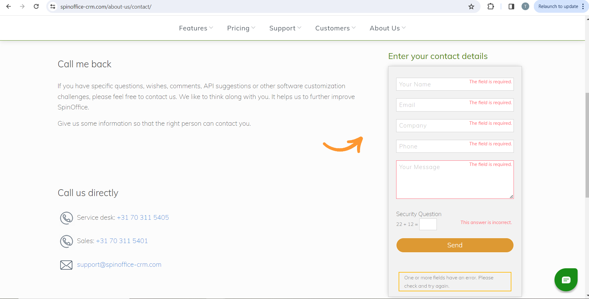
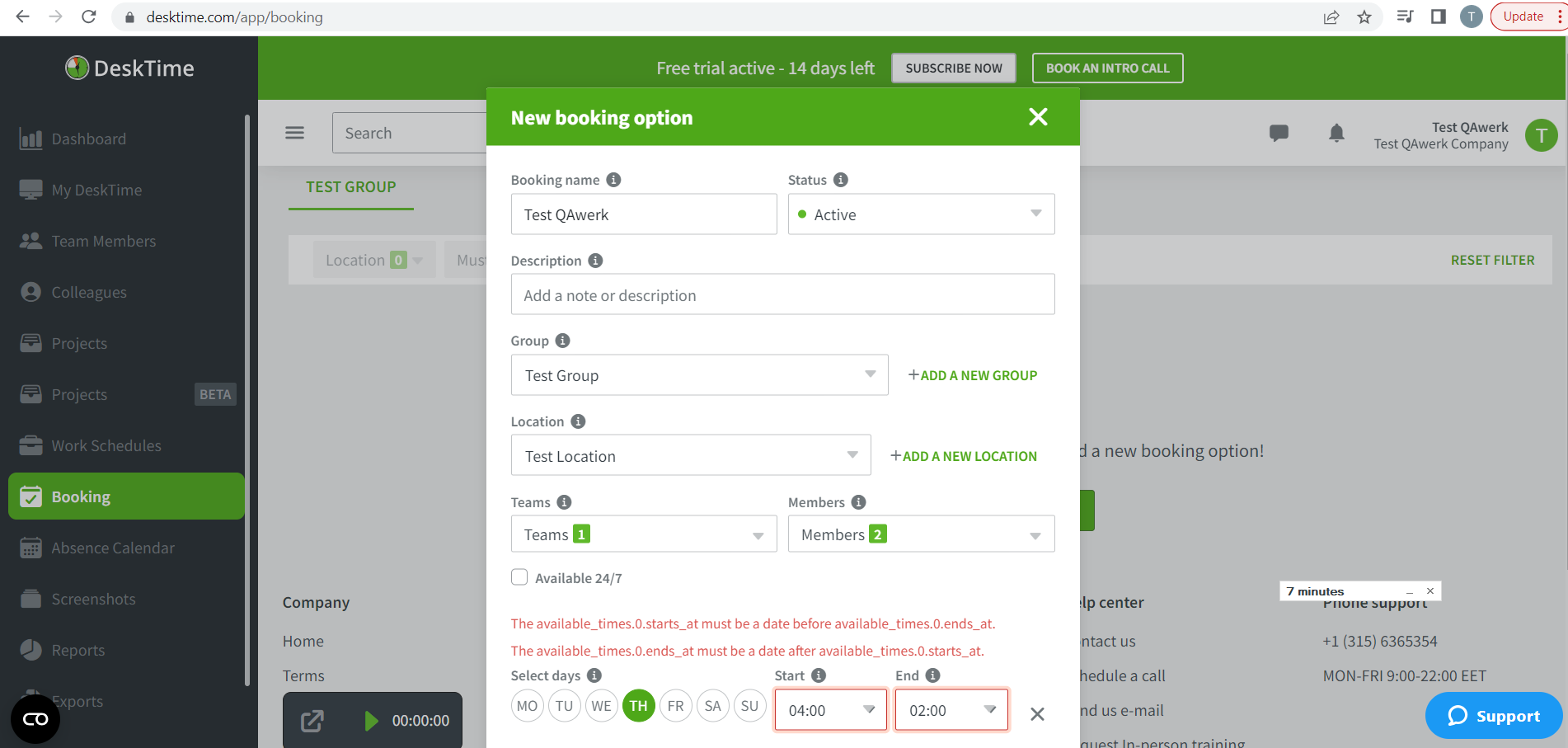
- Test the display of validation feedback, like color changes or icons, near input fields for different scenarios (valid, error, warning)
- Ensure that error and warning messages are visually distinct and do not obstruct other form elements
- Verify the placement and style of error messages, checking their alignment with the corresponding input fields
- Evaluate the visual state changes of buttons and form controls, like hover, active, disabled, for consistency
- Test the visual indicators of interactive elements like checkboxes and radio buttons for clarity and responsiveness
- Inspect the alignment and spacing of buttons and controls within the form, ensuring they follow the design guidelines
- Verify that form elements resize and reposition correctly on different devices and orientations
- Test the visual integrity of forms in both landscape and portrait modes on mobile devices and tablets
- Check how multi-column form layouts adapt when viewed on smaller screens or resized browser windows
Feedback on Submission:
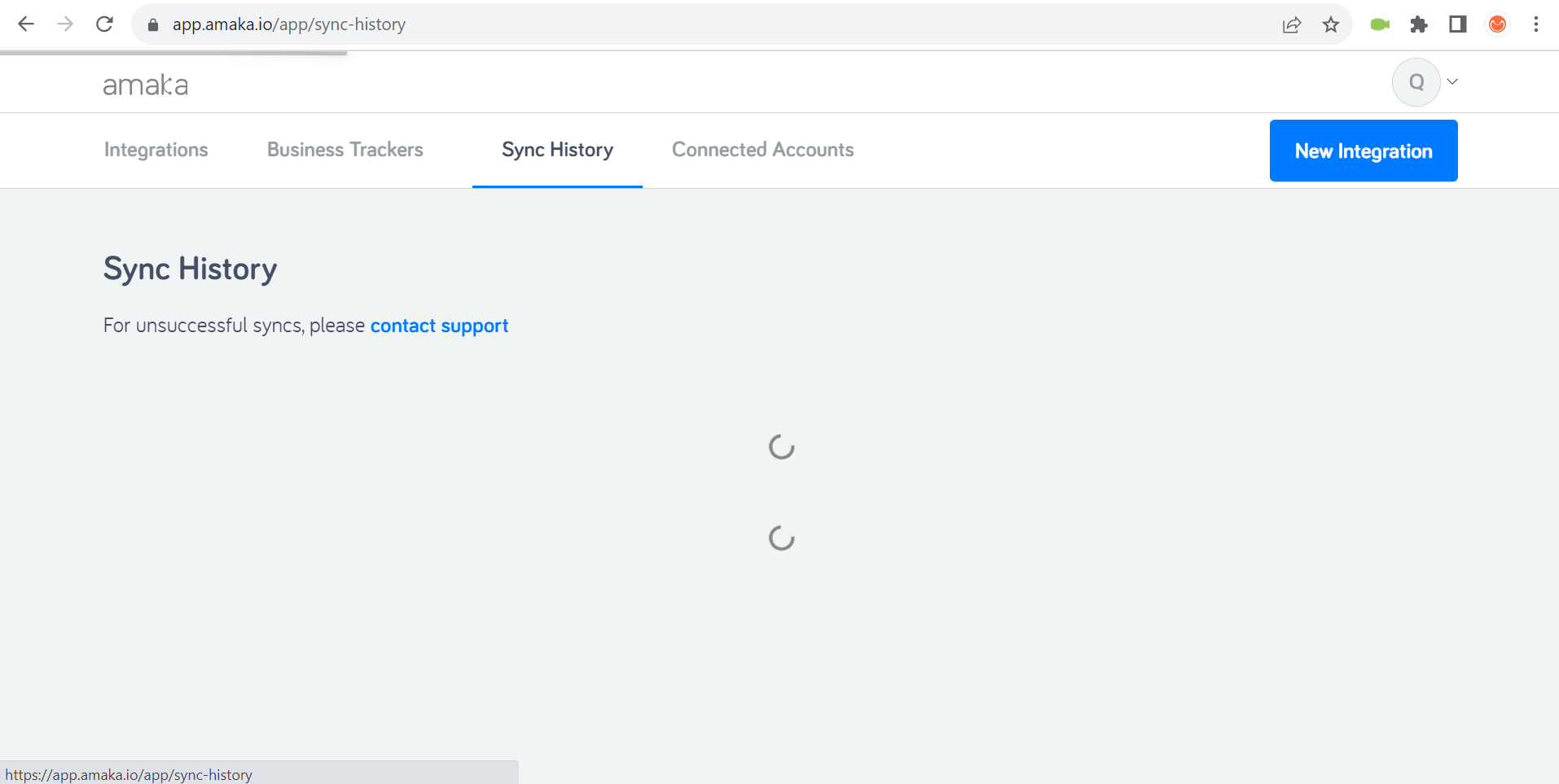
- Check for the appearance and disappearance of feedback messages or progress indicators after form submission
- Ensure that feedback messages are clearly visible and positioned appropriately on the screen after submission
- Test the visual representation of form states post-submission, such as resetting or retaining data in fields
- Evaluate the visual and functional integration of dynamic form elements like sliders or toggles within the form layout
- Test the responsiveness of dynamic elements, ensuring they adapt to different screen sizes without breaking the form design
- Inspect the visual feedback of dynamic elements when interacted with, such as color changes or animations
Form Data Processing:
- Visually inspect the alignment and readability of any data presented in forms, like confirmation numbers or pre-filled information
- Test the visual cues indicating successful or unsuccessful data processing, such as color changes or icons
- Evaluate the user interface during data submission, ensuring that elements like loading indicators are clearly visible and informative
Interaction
Interaction testing examines how users interact with your interface elements, ensuring that buttons, links, forms, and other components function as expected. Let’s delve into the specifics of interaction testing.
Button Responsiveness:
- Confirm that buttons change appearance when interacted with, e.g., hover or click effects. This can be checked with manual testing
- Ensure that button clicks result in the expected actions, such as form submission or navigation. Automate using tools like Selenium to replicate user clicks and verify outcomes
- Test the responsiveness of buttons under different conditions, like slow network or high load, to ensure consistent functionality
- Hover over links to check for expected visual changes, like color change or underline, indicating interactivity and improving user experience
- Test links for responsiveness and ensure they are easily clickable on various devices, including touchscreens
- Ensure dropdown menus open and close as expected on user interaction. This can be checked manually and with automated UI testing tools
- Check accordions and toggles for correct expand/collapse behavior and ensure they display the appropriate content upon interaction
- Test the responsiveness of these elements, ensuring they function smoothly without delay or glitches
- Verify the visual feedback of accordions and toggles, such as changes in icons or colors when activated or deactivated
Sliders and Carousels:
- Ensure sliders and carousels respond correctly to user inputs, such as dragging the slider or clicking carousel navigation
- Test the automatic rotation feature in carousels, if applicable, and its interaction with manual controls
- Check for the responsiveness and smoothness of transitions in sliders and carousels on different devices and screen sizes
Custom Cursor Interactions:
- Verify that custom cursors display correctly on specified elements upon hover
- Test the functionality of custom cursors on interactive elements, ensuring they provide the intended user feedback
- Check for consistency of custom cursor behavior across various browsers and operating systems
Accessibility
Testing your app for accessibility is key in ensuring your user interface is inclusive and usable by everyone. When performing accessibility testing, pay attention to the following aspects.
Color Contrast:
- Use tools such as WebAIM’s Color Contrast Checker to ensure that text and background color combinations meet the minimum contrast ratios required for readability by users with visual impairments
- Check for color contrast in interactive elements like buttons and links to ensure usability for users with visual impairments
Screen Reader Compatibility:
- Use screen readers like NVDA, JAWS, or VoiceOver to ensure all content and navigation are properly announced, including ARIA attributes
- Test interactive elements like forms and dropdowns with screen readers to verify that control elements are correctly identified and actionable
- Evaluate dynamic content updates for proper screen reader announcements, ensuring real-time changes are accessible
ARIA Roles and Landmarks:
- Utilize tools to confirm correct assignment of ARIA roles to elements, enhancing semantic understanding
- Verify ARIA landmarks are used effectively for defining regions of the page for quick navigation via assistive tools
- Test for proper usage and accessibility of complex ARIA roles, especially in dynamic content or custom controls
Multimedia Content:
- Ensure all video content has accurate captions and transcripts for users with hearing impairments
- Provide audio descriptions for videos containing essential visual content
- Check multimedia player controls for accessibility, ensuring they are operable via keyboard and screen readers
Dynamic Content Accessibility:
- Test areas with dynamic updates, like notifications, to ensure they are marked with ARIA live regions and announced by screen readers
- For SPAs or AJAX-loaded content, ensure updates are detectable and readable by screen readers
- Verify that user actions leading to dynamic changes provide immediate and accessible feedback
Image Alt Text:
- Use both automated tools and manual checking to ensure all images have descriptive alt text, excluding purely decorative ones
- Verify that alt text effectively describes the function or content of images for screen reader users
- Check that images used as links have alt text describing the link destination or action
Document Structure:
- Validate the proper use of heading tags to create a structured, navigable experience for screen reader users
- Ensure HTML5 semantic elements are used appropriately to aid in communicating structure to assistive technologies
- Check for consistent and correct use of landmark roles alongside HTML5 elements to enhance document structure accessibility
Zoom and Scaling:
- Test the UI for usability and readability when text is increased up to 200%
- Ensure proper scaling for mobile devices and that pinch-to-zoom is enabled for magnifying content
- Verify that layout and functionality remain intact when users employ browser zoom or text resizing tools
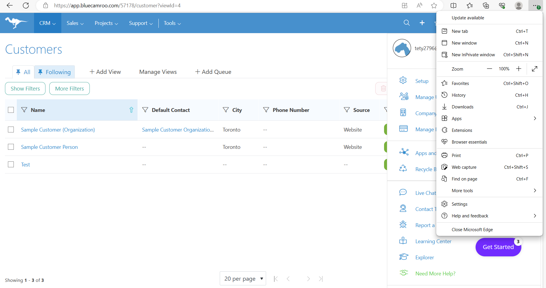
- Test custom widgets or controls with various input methods and assistive technologies for full accessibility
- Evaluate the implementation of ARIA states and properties in interactive components to convey correct information to assistive tech
- Ensure custom controls like sliders, toggles, and dropdowns are fully navigable and usable with keyboard and screen readers
Compatibility
Compatibility testing is a crucial step to guarantee your user interface works seamlessly across various browsers, devices, and platforms. With the following steps, you’ll be able to ensure your UI delivers a consistent and reliable experience, regardless of the user’s environment.
Browser Compatibility:
- Use tools like BrowserStack or LambdaTest to test UI rendering and functionality across browsers including Chrome, Firefox, Safari, and Edge
- Verify the UI on older browser versions, using tools like IE Tab or VMs with older browsers, to ensure fallbacks function properly
- Test for CSS and JavaScript compatibility across different browser versions, focusing on features with known cross-browser issues, such as CSS transforms, animations, arrow functions, etc.
- Test the UI on various operating systems (Windows, macOS, Linux, iOS, Android) using virtual machines or device farms
- Check for any OS-specific functionality or integrations, like sharing extensions on iOS, and validate their performance
- Ensure consistent appearance and behavior of the UI across different operating systems, including font rendering and layout
Mobile Compatibility:
- Use mobile emulators in browser dev tools to check if the viewport meta tag is correctly set, ensuring proper scaling on mobile devices. The content should be sized and scaled appropriately withpresent in thetag
- Test on actual devices or through simulators for correct touch gesture recognition and response
Network Compatibility:
- Use network throttling tools in browser dev tools to simulate different network speeds and test UI component loading and performance
- Test any offline capabilities, like service worker caching, to ensure graceful degradation of the application
- Evaluate the performance and stability of the UI under conditions of packet loss, latency, and other common network issues
Plugin or Extension Interaction:
- Test for UI conflicts or issues with common third-party plugins or browser extensions
- Check if fallback content or instructions are provided where browser plugins (like Flash or Java) are not available or disabled
- Check for consistent UI behavior in browsers with ad blockers or privacy extensions that might alter script or content loading
Screen Orientation:
- Test on mobile devices for smooth UI layout and functionality adaptation between portrait and landscape orientations
- Verify that all interactive elements and content remain accessible and usable upon orientation changes
- Ensure media (images, videos) and graphics adjust correctly and maintain quality in different orientations
Internationalization and Localization:
- Verify date, currency, and other locale-specific formats across different locales
- Ensure UI components adjust appropriately for languages with different writing directions, like RTL scripts
- Test localized versions of the UI for consistency in layout, especially when changing text size or direction

Our Experience with UI Testing
QAwerk is an established provider of software testing services to businesses across North America, Australia, New Zealand, and Europe. We’re skilled in manual and automated testing of games, e-commerce, e-learning, fintech, graphic design, fitness, and content creation platforms.
To help businesses discover critical bugs and create addictively satisfying digital experiences, we combine several types of testing. UI testing is just the tip of the iceberg, but because it’s right there on the surface, it deserves a lot of attention.
One client who benefitted from our UI testing expertise is Penpot, an open-source design and prototyping platform. UI bugs are unacceptable for a product that is all about creating visuals. We’ve reported numerous UI issues, such as overflowing text and overlapping elements, along with high-priority functional and performance bugs.
They were still a beta when they reached out and relied solely on internal resources. With our tech guidance and support, Penpot adopted effective QA workflows, allowing them to consistently catch critical and minor bugs before they reach users. We helped them prepare for the official release and delight over 250K users with killer features and new capabilities.
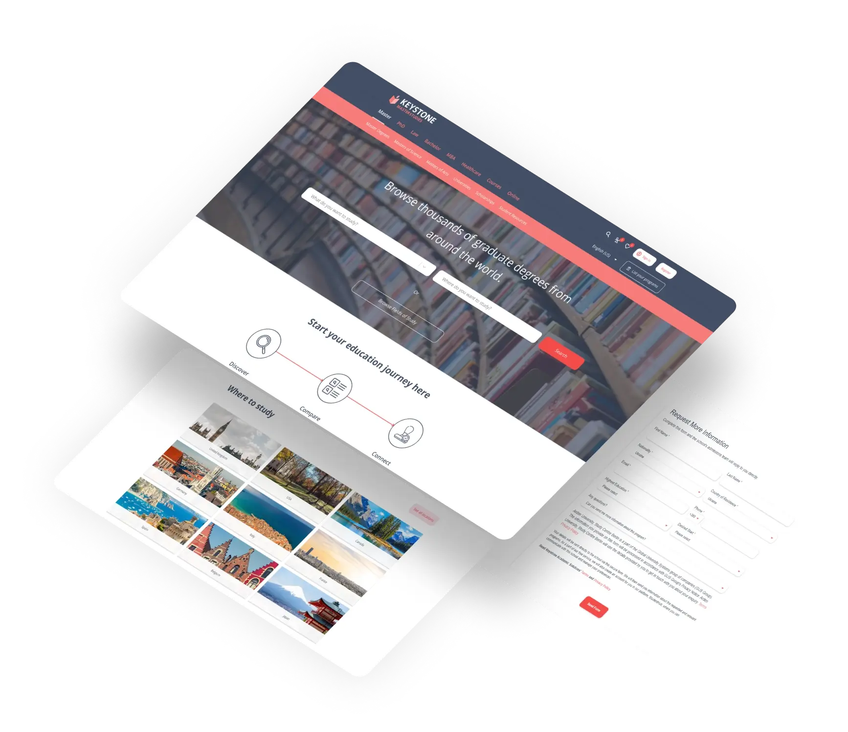
Keystone, Unpakt, Evolv, Arctype– these companies and many others leveraged our web testing prowess to win customers’ love through seamless and well-polished experiences.
Let’s chat if you’re looking for a software testing partner to bolster your QA efforts. We’d love to put our skills to good use and help you grow.
See how we helped Keystone
improve user flow and conversion
by eliminating critical UI bugs
